

One of the first things you may consider when creating your presentation design is a colour scheme, and this simple task can also be one of the most difficult to get right.
Whether you are using an online presentation tool like Presbee or sticking with the old-school PowerPoint presentation, the colours you choose can have a big impact on how your presentation is perceived. If you can get your colour scheme right, then chances are, the rest of your presentation design will follow suit and be professional and aesthetically pleasing.
Here are a few of our top tips for using colour in your presentation design.
Be aware of how it will look once projected
If you are going to be presenting to a large group of people then the chances are you’ll be using a projector to enlarge your presentation. This is especially easy when using an online presentation tool like Presbee as you can access your presentation on any computer, including the desktop computer most likely connected to the room’s projector!
But as I’m sure you will have experienced in the past, some colours do not translate to projection well. Especially if you place certain colours against too similar backgrounds – it will be impossible for your audience to read. Colours that are too light will be also hard to read, even against white. Pale pink, yellow, pale blue, all of these colours will just blend into a white background and leave your audience squinting.
Choose your colour combos wisely
Certain colours do not go together, and we’re not talking from an interior design point of view. Certain colours when put together, can even literally give your audience a headache. Clashing colours may stand out but if you want your audience to actually read and engage with your written text then don’t go for anything too clashing.
What does your colour convey?
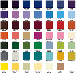
We all associate certain colours with certain emotions, commands or ideas. For example, red equals stop, green equals go. Red may also be associated with anger, but also romance or lust. Blue is usually associated with calm and trust, and also feelings of sadness or solemnity. You don’t have to do extensive research into the associations of colours because we have put together this post on colour meanings for you.
Graphic Backgrounds
If you have chosen to use an image or graphic as the background for one, or all of your slides, then be aware of how your chosen text colour is going to contrast with it. Anything too close to the colours of the background, as mentioned before, will be really hard to identify, and if the colour of the background changes then it can be quite a difficult task to choose the right colour. The best way to avoid any problems is to make sure your background is quite subtle in colour change, or just make sure you place your text in front of the part of the image or graphic with the most uniform colour.
Oblivious to colour?
If you just have no idea which colours match or which colour schemes are aesthetically pleasing or even #trending, then why not skip the research and use a ready-made template for your presentation from Presbee? There are tonnes of templates to choose from, that will match your content perfectly – why not check out our gallery for an idea of what you can create?
So to avoid that awkward situation where you are altering your colour scheme and design mid-presentation, keep these tips in mind when creating your presentations.
Are you a colour scheme expert? Do you closely associate colour with emotions? Do you actively choose a colour scheme for your presentation depending on its content?
You can check out more of the features of Presbee here. If you want further tips on choosing the right images for your presentation then why not check out our article with lots of advice and tips.
 Protect your Intellectual Property.
I am genuinely pleased to read this blog posts which includes lots of useful
information, thanks for providing these kinds of information.
Greetings from Colorado! I’m bored to tears at work so I decided to browse your site
on my iphone during lunch break. I really like the
information you provide here and can’t wait to take a look when I get home.
I’m amazed at how fast your blog loaded on my phone ..
I’m not even using WIFI, just 3G .. Anyhow, superb blog!