The header image for your website will usually be the first thing a user will see which is why it needs to stand-out and be engaging to them. Here’s how you can achieve that…
Choose the best image
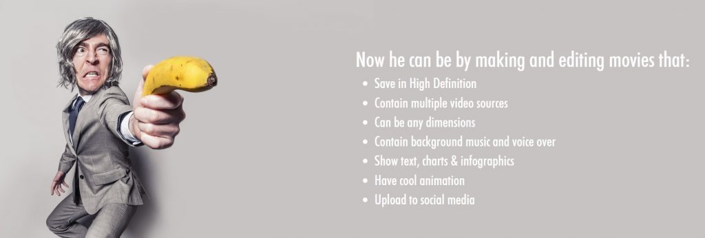
This image needs to be clear, professional, bright and eye-catching. What do you think of ours on Presbee? Each section has a different, yet striking header image. Just check out our movie maker header, it certainly gets your attention:

Note the colour use here. The greys are really effective next to the yellow as well as the angle the picture has been taken at. Each of our headers take the theme of being interesting, a bit different but most definitely memorable.
Of course, what you decide upon will really depend on your company and the message you want to send out. We hope that ours make us seem fun, approachable and design experts. What is it you need to be able to convey?
Text
An image alone isn’t enough to engage with your user, you need to add text to provide more information. When a customer clicks onto your site they need to be able to see clearly who you are, what you do and what you can offer. With Presbee’s design software you can easily add text in a range of fonts, colours and alignment:

In our presentation designer, you can add transitions, animation and playful features which will really grab your users attention. You can see how we have incorporated this over on our main site landing pages.
Create Distinct Messaging
What is your tagline? Do you even have one?! Have a think about how this could benefit your business or service. If you can come up with something catchy and snappy it will really help in making your site memorable. People always like a clever play on words, this can be hard to achieve without sounding cheesy so definitely do some market research and test out a few ideas before you go ahead and create your header. Either that or you can be straight to the point and let your user know exactly what it is you do…

Use Layering
Have you ever thought about making your site more interesting by adding layers across your header? You could partially show what is behind a ‘blanket’ of layer to give a sneak peek of a new product, you could fade out the background so your text stands out, you could create a larger logo across your photo… there are plenty of fun options to choose from and don’t feel as though you always need to stick to the same thing. Have some fun and use different headers for each landing page, wouldn’t it be great if that blanket slowly revealed more of your new product as each page was clicked on? Think outside the box and keep the user on your site for longer.

Add clickable content
Make your site super easy to use and add clickable content right there on your header. The image I have added above instructs the user to keep on clicking to see what will be revealed. Each page could lead to the next and as the user works their way through they will finally be taken to the brand new finished product which will be on sale. It is a very simple way to keep them engaged and if they like what they see they will keep coming back and may even recommend you to their friends!
Why not see what you can create with Presbee Design today?


 Protect your Intellectual Property.