As Presbee has recently moved into the world of online design, we thought we would demonstrate how easy it is to create a Twitter header for your business or personal account.
First of all, you need to sign up to Presbee. This is as simple as adding your name and email or logging in with Facebook or Linkedin. It is completely free to use most of our services but you can sign up to have access to many more features by selecting what you need from one of our packages.
Once you are signed up it is really simple to get started…
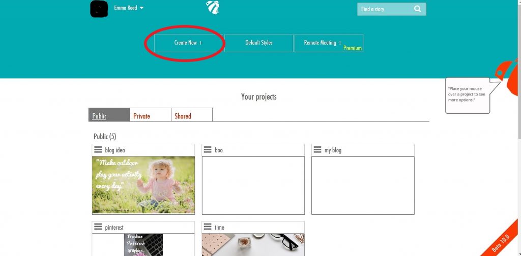
This is the screen you will be presented with. Here I can see the projects I have already worked on and have saved. You can see at the top it says create new. Click here to get you started…
You will then be given a large choice of templates ranging from headers to post images, document types, marketing materials and even film. You simply select the template you are after or if the size you want isn’t there, why not just customise your own?
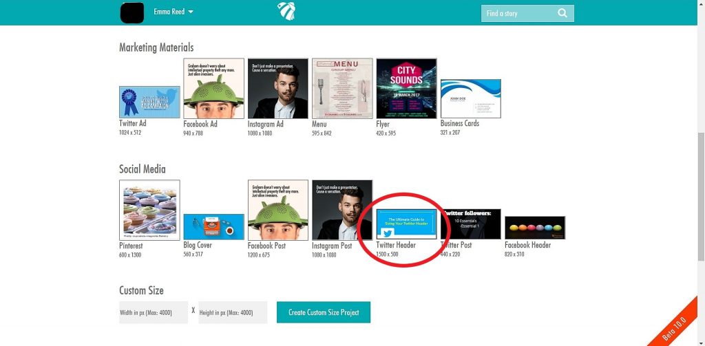
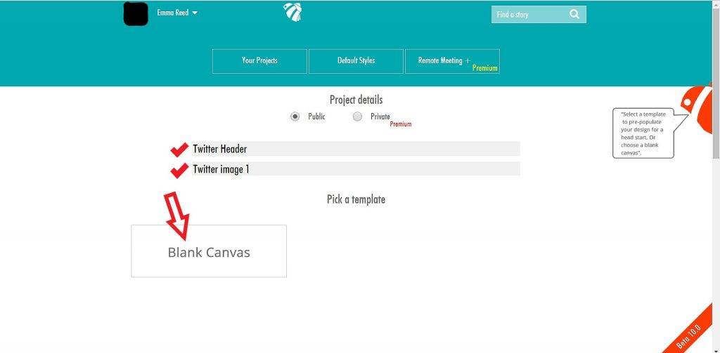
I have selected Twitter Header which is already set at the correct size of 1500×500. I am then taken to a page to add detail to my project. Before you can proceed you need to include a title and description. Then hit blank canvas:
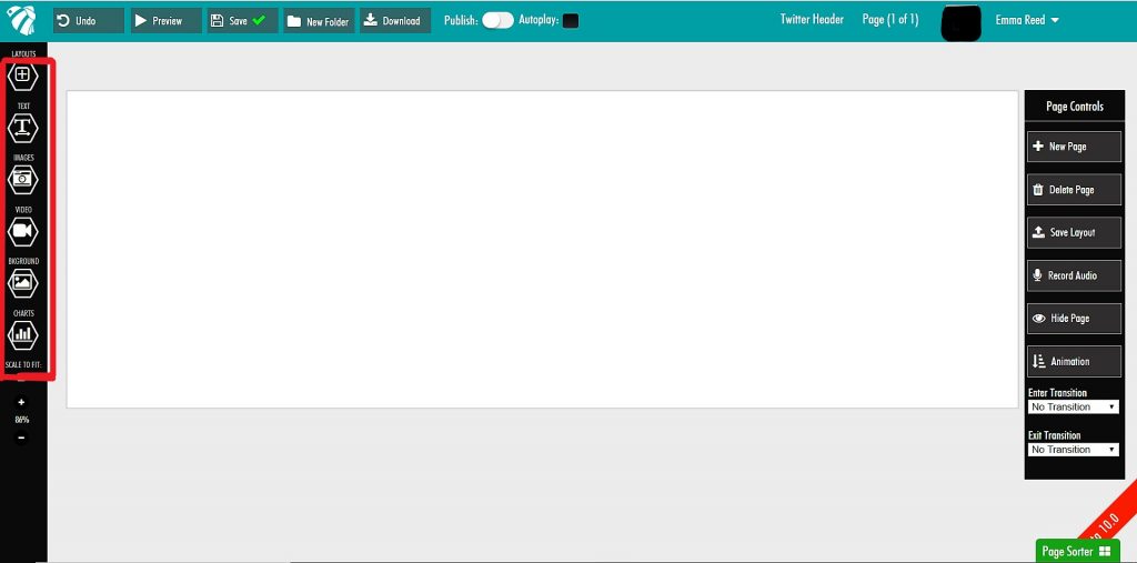
The next page is where you will create your fantastic new design. As you can see, all the options you need to create your design are right there down the left-hand side as highlighted by the red box: Layouts, text, images, video, background and charts.
I am choosing to make a single-image header for Twitter. I don’t have my own image so when I select the images tab from this menu I am given the options of using Presbee’s own large stock photo collection or Pixabay’s.
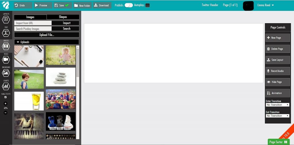
If you have an image of your own you can easily upload this from your device to use. Once an image is selected from any of the options, you can add it to the twitter header by dragging it across. But remember, image is everything (when it comes to social media)…
The image you choose really needs to reflect or say (or scream) what it is you do. An image is the first thing a user will notice and they can easily be put off by one glance so you’ve really got to get this right. We retain 80% of what we see over what we read so if you want to keep that person on your page and hitting that follow button, you need to give them a big reason to. Work with themes, matching colours from your website or logos and make sure your message is clear.
My (fake) company is an accountancy firm so I have selected an image which I hope will both say what I do but also catch the users attention.
I could leave it as it is but I think I need to be obvious and say what it is my account is all about…
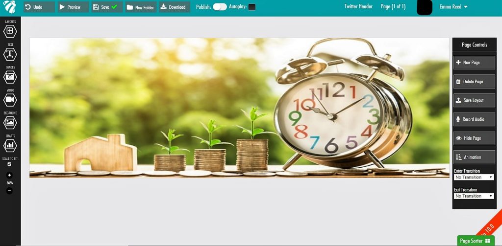
The text tab allows you to add a heading, subheading or text. Just click and drag this over your image. The text box can be moved at any time to get your positioning spot on. You can also change the size, colour and font to suit.
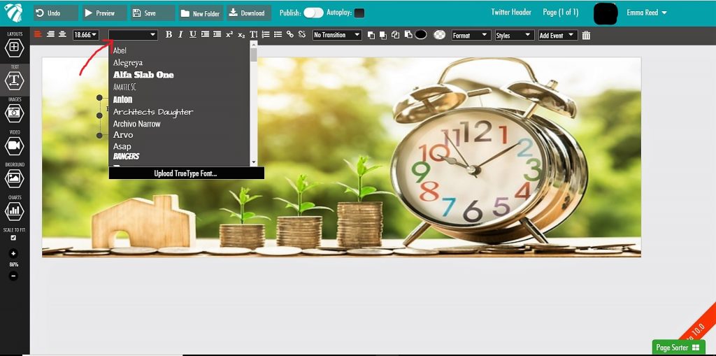
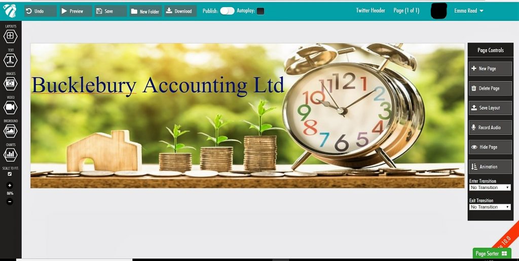
With my text added and in place, I can then preview my work to see how it will look once I download it to my device. If you aren’t happy with what you see just pop back a step and continue to make changes.

And there you have it, one completed Twitter Header which probably only took me 15 minutes to create.
You can save your work at any time and return to edit it later on. Every project you create is saved to your dashboard and all can be downloaded and used for your businesses’ needs as often as you like.
Why not see for yourself how easy it is to create your own and check out the other templates we have on offer.


 Protect your Intellectual Property.